Reorganized complex candidate data around how reviewers evaluate performance and make hiring decisions.
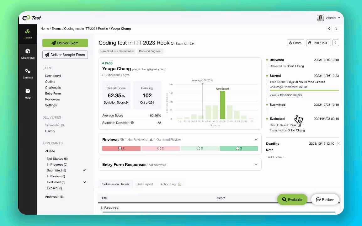
A clearer path from performance overview to deeper investigation.
Used sales interviews and reviewer workshops to uncover how people assessed performance, compared candidates, and selected who should move forward.
Mapped the most important findings to score context, information hierarchy, and clearer investigation patterns.
Used concept validation, post-launch heatmaps, and a metrics workshop to evaluate the direction and define success signals for future iterations.
Track Test's candidate report already contained scores, challenge results, submitted code, written responses, activity history, IP information, playback, and signals that might indicate unusual behavior.
But the product had grown gradually. Different candidate statuses introduced new page variations, while monitoring features added more information without a shared hierarchy.
My first instinct was to simplify the interface.
The deeper problem was that the report reflected how the system stored information, not how reviewers formed a judgement.
The report could show what happened. It could not tell reviewers where to begin.
I began by speaking with the sales team, who regularly heard customers' questions about the report.
Their feedback highlighted recurring uncertainty: whether a score was genuinely strong, how a candidate compared with others, and which unusual activities deserved further investigation.
I then independently planned and facilitated a workshop to reconstruct the full review process.
Rather than asking participants to critique the interface, I asked how they actually reviewed a candidate: what they checked first, when they opened the code, what made them question a result, and what gave them enough confidence to move someone forward.
The workshop revealed three decisions hidden inside what we had been treating as one report:
How did this person perform? How does that performance compare? Should this person move forward?
Reviewers combined challenge scores, completion time, written explanations, code quality, copy-and-paste activity, playback, code similarity, IP information, and test-leaving events.
The information existed, but it did not follow their thought process.
The problem was not missing data. It was missing prioritization.
| What I learned | What it meant | What I changed |
|---|---|---|
| Reviewers could not interpret the total score alone | Performance lacked comparison context | Added score distribution and brought result context forward |
| Reviewers moved across pages to form a complete picture | The report did not follow the review sequence | Reorganized the page into overview, context, and investigation layers |
| Suspicious behavior depended on several inconclusive signals | Evidence needed to be visible without becoming a verdict | Consolidated monitoring signals while preserving reviewer judgement |
The total score was usually the first thing reviewers checked, but the number alone was difficult to interpret.
An 80 could appear strong or weak depending on the challenge and the wider applicant group. Reviewers wanted comparisons with other candidates or internal engineers, but the available data could not support every comparison responsibly.
I prioritized score distribution because it offered useful context using data we already had, without overstating what the score represented.
The original report treated summary information, challenge details, code, and monitoring evidence as equally important.
Hiring managers needed a clear overview, while engineering reviewers still needed detailed evidence.
I reorganized the report so reviewers could begin with the result, understand it in context, and investigate deeper evidence only when necessary.
Reviewers combined copy-and-paste activity, playback, IP information, code similarity, completion time, and test-leaving events when investigating suspicious behavior.
These signals were scattered across different parts of the existing product.
None proved misconduct on its own, so I brought them into a clearer investigation path without turning them into an automatic cheating score.
The interface should reveal evidence without pretending to make the final judgement.
Once the direction became clear, I ran a concept-validation session with seven reviewers.
I showed both the existing and redesigned experiences and observed what participants noticed first, how they interpreted the score, where they searched for evidence, and whether the new hierarchy changed the order of their review.
The sessions confirmed that candidate identity, score context, and overall performance needed to appear earlier. They also exposed details that were still too prominent or difficult to find.
I used those findings to refine the hierarchy before finalizing the design.
I was not validating whether the redesign looked better. I was validating whether it supported a better review process.
What should reviewers understand first?
One direction emphasized overall evaluation. Another foregrounded scores and skills. A third prioritized faster access to detailed evidence.
Through several iterations, the design converged around a clearer sequence:
Result → context → investigation
The final structure was then applied across evaluated, submitted, in-progress, and other candidate states.
After launch, I reviewed Microsoft Clarity heatmaps to understand where users concentrated their attention.
The strongest activity appeared around candidate information, overall results, score distribution, navigation, and review controls. These were the same areas we had prioritized through qualitative research.
The evidence had limitations. I did not have a reliable before-and-after baseline, so I would not claim a specific reduction in review time.
The heatmap supported a narrower conclusion:
The areas identified as decision-critical during research were also where users concentrated their attention after launch.
During the project, I also facilitated a metric-definition workshop to help the team discuss how future tasks should be evaluated.
We worked from:
Goal → Signals → Metrics
Rather than starting with whatever data was easiest to track, we discussed which user behaviors would indicate that a change was working.
We organized possible measures across experience, feature, and business levels, as well as short-, mid-, and long-term horizons.
I consolidated the workshop outcomes into a shared metrics document so the team could reuse the framework when defining success for future tasks.
The goal was not to create a product-wide measurement system. It was to bring success criteria into the task before the next iteration began.
The redesign gave scores clearer context, organized scattered evidence around the reviewer's decision, and made unusual behavior easier to investigate without overstating its meaning.
Its hierarchy also influenced related review and sharing experiences, creating a more consistent way for Track Test to present assessment evidence.
More importantly, the project connected multiple forms of evidence into one design process.
Sales feedback and the first workshop helped me define the problem. Concept validation showed whether the new hierarchy supported reviewers more effectively. Post-launch heatmaps provided directional behavioral evidence. The metrics workshop helped the team clarify how future improvements could be evaluated.
I began the project thinking I was simplifying a complicated dashboard.
By the end, I understood that I was designing the path between evidence and judgement.
I used qualitative research to understand the decision, design to restructure it, and quantitative evidence to examine whether the new hierarchy directed attention as intended.